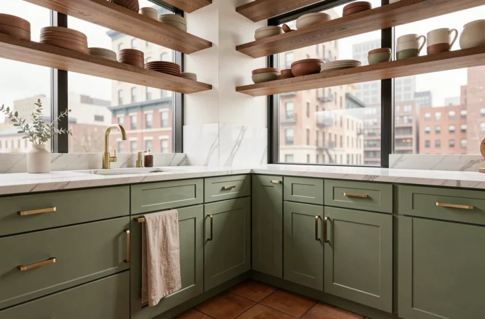
All-white kitchens and cool grays are losing ground to more complex palettes. We are seeing a clear shift towards warm neutrals, bold wood tones on the main facade, and bi-tone schemes that structure the space without overwhelming it. Here are the color trends that matter for a modern kitchen in 2025.
Bi-tone scheme in the kitchen: dark base cabinets and light upper cabinets
The monochrome kitchen is a thing of the past. The prevailing principle is based on a controlled contrast between base cabinets and upper cabinets: lower facades in forest green, slate blue, or matte black, with upper cabinets in light wood or cream tones. This division creates a visual demarcation line at countertop height, anchoring the room without darkening it.
The central island serves as a colorful focal point. We recommend treating it in a bold shade (deep terracotta, duck blue) while keeping the rest of the cabinetry understated. This approach allows for the integration of color in a targeted volume, which can be easily modified at a lower cost if trends change.
Designers note that clients are becoming less fearful of color, but they are using it on specific surfaces: island, lower cabinets, backsplash. Choosing a trending kitchen color for 2025 thus depends as much on location as on the hue itself.
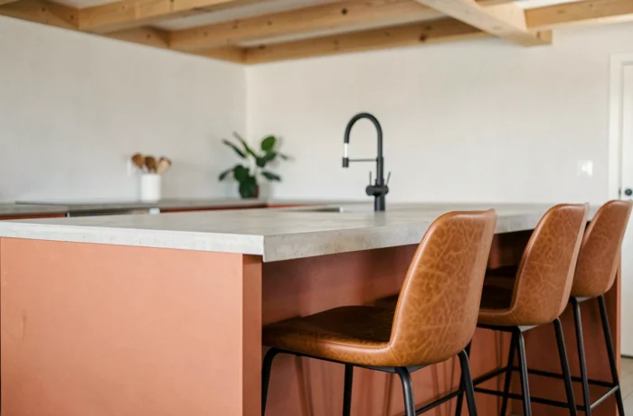
Warm neutrals and wood tones: replacing cool white in kitchen facades
Optical white gives way to a family of warm neutrals that radically change the ambiance. Mushroom, taupe, greige, and cream are the four pillars of this palette. These shades absorb light differently than pure white: they reduce harsh reflections under LED lighting, which is common in kitchens.
Wood is no longer confined to countertops or island cladding. It appears on the main facade, in light oak or walnut, treated as a color in its own right. The combination of visible wood and warm beige walls creates a cozy effect without resorting to saturated colors.
What materials to pair with neutral tones
- Polished concrete as a backsplash adds a raw texture that avoids the overly smooth look of beige monochrome kitchens
- Terrazzo, with its colorful marble chips, introduces a subtle pattern compatible with wood or greige facades
- Veined marble (like Calacatta) works well as a countertop to elevate a taupe ensemble, provided the surface area is limited to avoid a classic look
A common mistake is to multiply natural materials without hierarchy. We recommend one dominant material for the facade, a second for the countertop, and a third for the backsplash, no more.
Deep shades for kitchen walls: forest green, slate blue, and terracotta
Painting a kitchen wall in a saturated shade remains the quickest and least expensive decor lever. Three color families stand out clearly for walls in 2025.
The forest green works particularly well in north-facing kitchens, where its depth compensates for the lack of direct light. It pairs well with brushed brass accessories and light wood shelves.
The slate blue brings immediate sophistication. On a single wall, behind a line of off-white cabinets, it structures the space without overwhelming it. Paired with white subway tiles as a backsplash, the contrast is sharp and readable.
Terracotta, warmer in tone, is suitable for kitchens open to the living area. Its orangey hue creates a natural continuity with wood tones and linen textiles. On walls, it holds up well with matte finishes, which enhance its mineral quality.
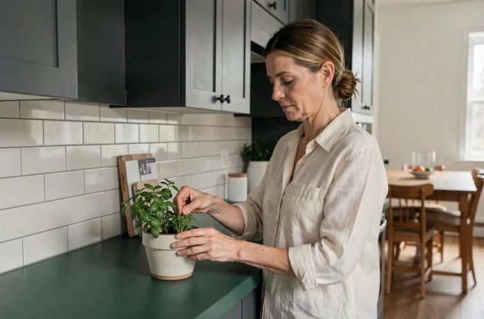
Matte or satin finish: impact on color rendering
In the kitchen, the finish alters the perception of color as much as the hue itself. A matte paint absorbs light and intensifies deep tones, but it is more sensitive to grease splatters. The satin finish offers the best compromise between faithful color rendering and ease of maintenance.
For lacquered cabinet facades, the ultra-matte finish (soft-touch) is gaining ground. It eliminates distracting reflections and gives dark colors a velvety appearance that ages better than gloss.
Kitchen color and flooring: coordinate without uniformity
The floor is often the neglected aspect of the color project. With facades in bold shades, the flooring must serve as a unifying element without competing visually.
- Large-format stoneware tiles in stone tones (light beige, sand) unify the space under two-tone cabinetry
- Whitewashed oak flooring creates a bright base that supports both forest green cabinetry and a terracotta island
- Geometric patterned cement tiles work well in small kitchens to energize a set of neutral cabinets, but they can quickly saturate the space if the facades are already colorful
A neutral and light floor remains the most versatile choice when color is already carried by the cabinets or walls. Reserve patterned floors for kitchens where the furniture remains understated.
The relationship between wall color, cabinet hue, and floor tone forms a triangle that must be balanced. If two of the three elements carry color, the third should remain subdued. This simple rule avoids color overload, which dates an interior faster than any trend.